Tutorial to create a speedometer chart with Excel step by step.
Build a speedometer chart in Excel with this step by step guide. Graphs are a strong point of Excel, they allow to gauge and therefore analyse performance graphically. Here is an Excel tutorial to create a simple tachymeter graph. To start, create a doughnut chart with only one data series.
First, for a gauge graph with eight zones, the doughnut chart in Excel must contain nine, one of which is equal to the sum of the other eight.
Table of Contents
1. Create the zones of the speedometer chart
In this tutorial, there are 4 zones, 3 plus 1 zone equivalent to the first 3 useful zones. These zones are simply created by a series of numbers, with the last one again equal to the first three.
- 33
- 33
- 33
- 99
To do this, create a list or table with the above 4 values, and simply follow the four steps below.
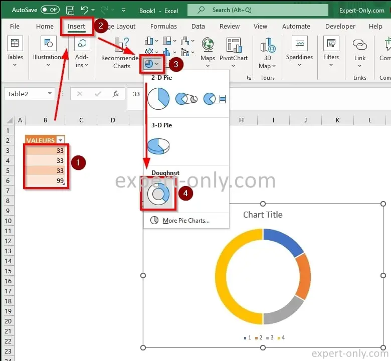
- Select the 4 values equivalent to the zones of the ring.
- Select the Insert menu.
- Choose the icon with the pie charts.
- Finally, choose the Doughnut chart type.
2. Hide the left part of the gauge chart
Then, still in the Insert menu, click the Format Data Point button after selecting the Excel chart. From the Fill tab, select No Fill to make the largest zone of the Excel chart invisible, above and to the left.
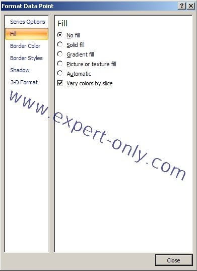
Once applied, only the left half of the pie chart is visible.

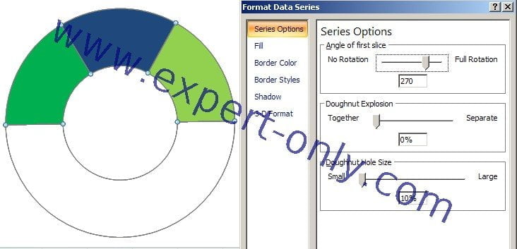
3. Rotate the speedometer graph
In the Series Options tab, adjust the rotation cursor option, called Angle of first slice, so that this zone is at the bottom. And place the line to separate the two parts of the Excel chart so that it is perfectly horizontal. Either with an angle of 270 degrees.
4. Add the needle to the doughnut chart
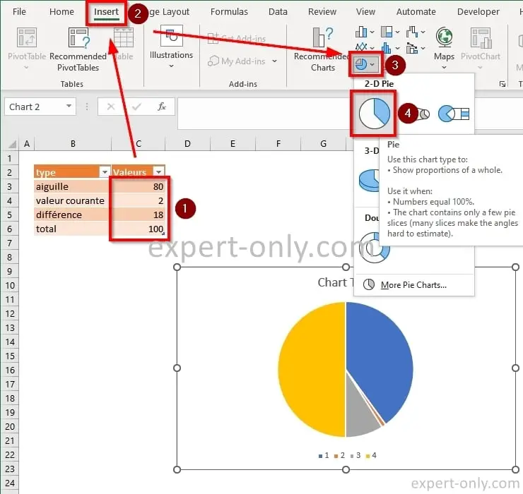
Now create the needle of the tachymeter chart. It’s simple, just create an Excel pie chart with 4 zones.
- The position of the needle on the chart, which is 80.
- The thickness of the needle, here it is 2.
- The third value is 100 minus the sum of the first two values.
- The fourth will be equal to 100.
For the third value, I used an Excel formula and is it equal to 100 – 80 + 2 = 18
5. Make only the needle of the graph visible
To make only the needle of the chart visible, select the graph and then click the Format Data Point button in the Data group under the Design tab. From the Fill tab, select No Fill to make the largest zone of the Excel chart invisible, above and to the left.
6. Overlap the graphs and adjust the gauge chart layout
Finally, to finalize this tachymeter graph with Excel, overlap the two graphs like this. To move the needle, change its value from the source table. If desired, you can also add data labels and a title to the chart to show the current value and label the axis.

To save the speedometer chart as a separate image, click the Export button in the Chart Tools group under the Design tab, then choose Save as Image.
Use Excel speedometer charts carefully
In conclusion, the Excel speedometer chart, also known as a tachometer chart, can be a useful tool for visually displaying data in relation to a predefined scale or gauge. However, it is important to keep in mind that this type of chart may not always be the best choice for data visualization. One potential issue with speedometer charts is that they can be difficult to read accurately, especially when there are multiple data points or a wide range of values.
It can also be challenging to compare data across different speedometer charts, as the scale and gauge may vary. In addition, Excel speedometer charts can take up a lot of space, which can make them impractical for use in certain situations.
To go further and learn more about the possibilities of the Excel software, learn how to pivot Excel data from lines into columns.


Be the first to comment